How to Use The 2017 Colour of The Year
09 Mar 2017
The Pantone Colour of 2017, Greenery, is a fresh and zesty yellow-green shade that evokes the first days of spring when nature’s greens revive, restore and renew. Greenery illustrates the flourishing foliage and the lushness of the great outdoors, and we’ve got some ideas on how to make green your next to go shade in your lovely abode:
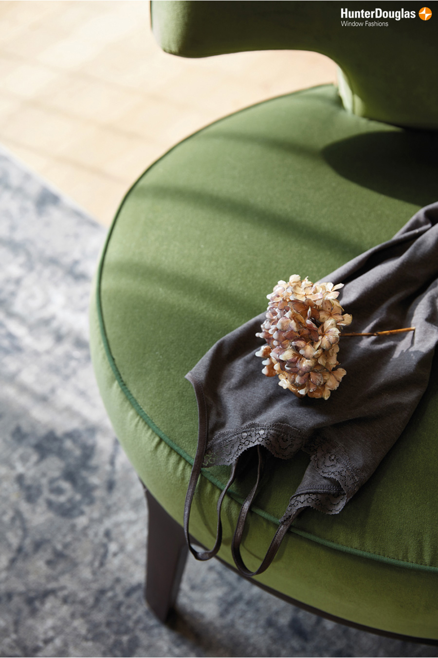
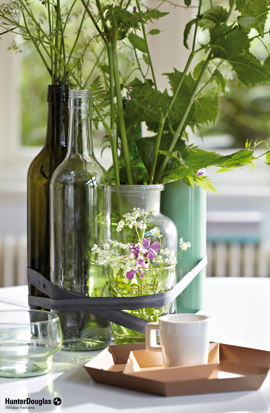
1. It loves texture: Explore the possibilities of using greenery in different textures for your furnishings. When combining with velvets or weaves, green can add some instant richness without being overpowering; a real grown up touch.
2. It can take change: Green in different shades work well together rather than fighting, so using it as a backdrop means you can use it to pull other items together coherently. Also, green is a neutral palette that blends with many other hues perfectly. For a soothing space, combine greens with earthy hues such as brown and beige; or add red and gold accessories to green background for an instant festive atmosphere.
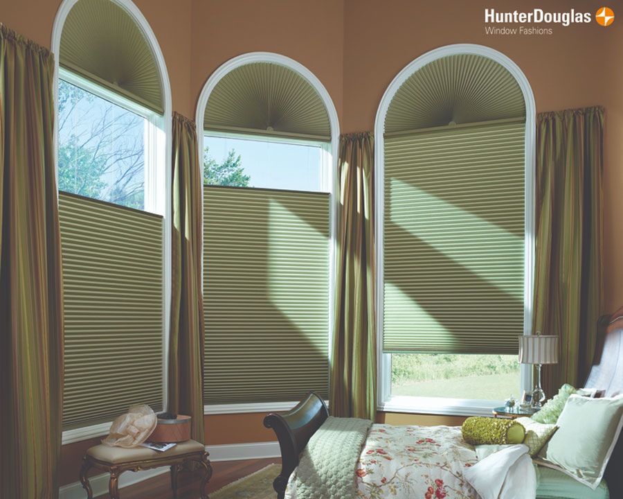
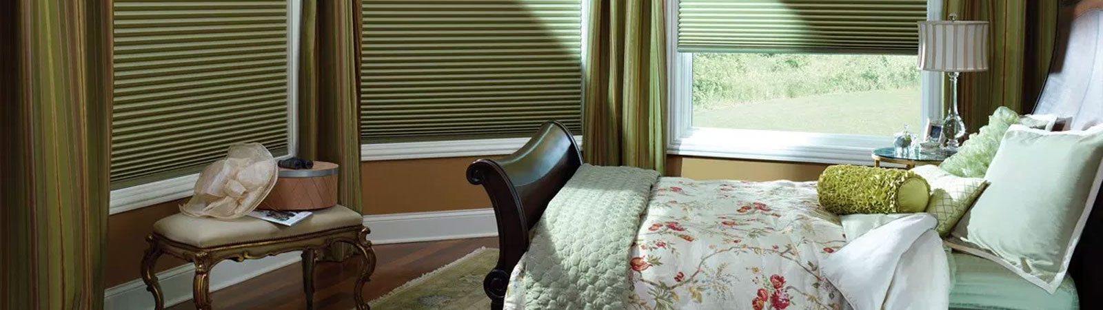
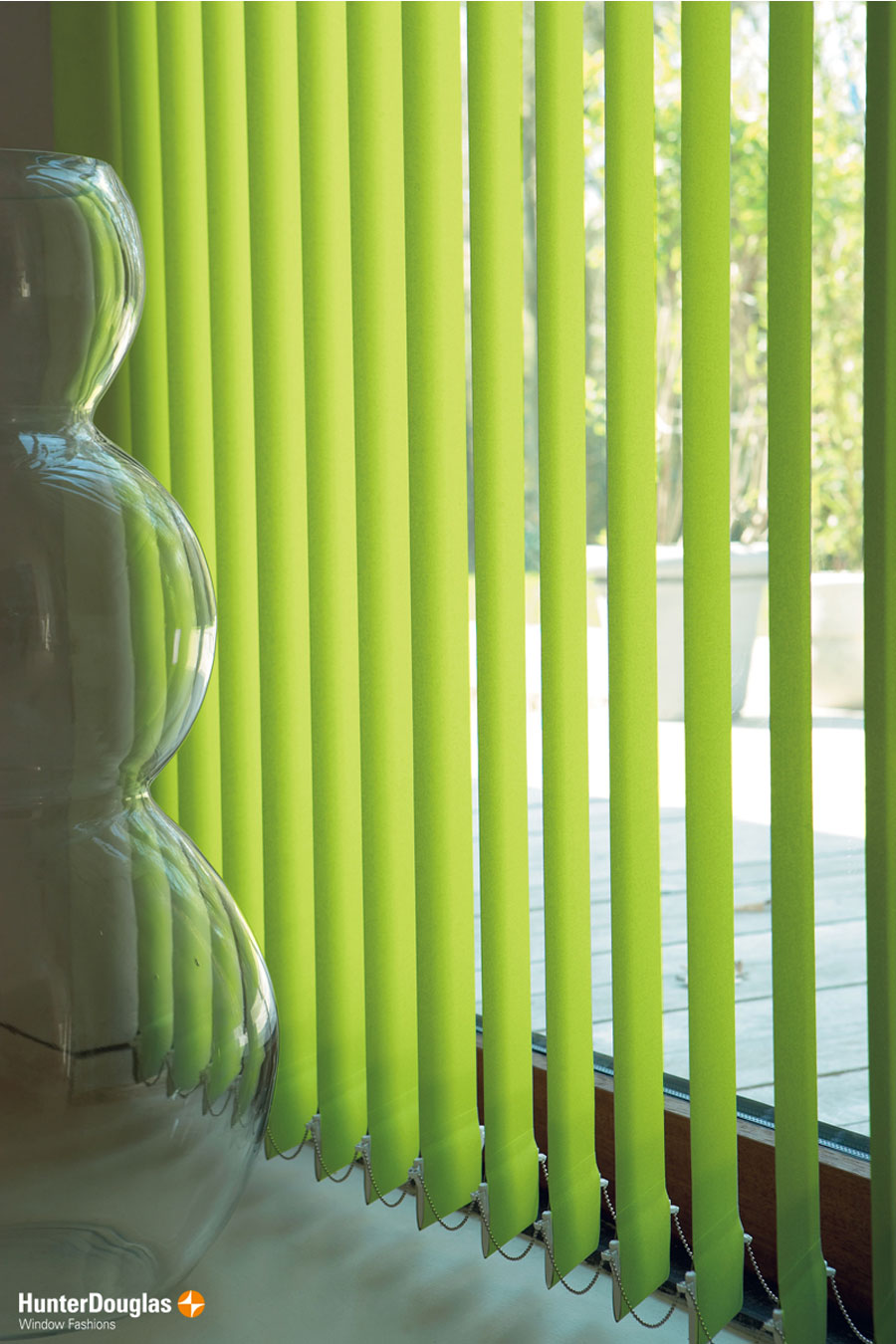
3. It has unexpected qualities: With a yellow base tone, green hues can enhance the glowing effect of daylight and make a room look brighter and sunnier. Try the different transparencies in our Duette® window shades range for making the most of it.
4. It makes you feel good: Calming on the nervous system, green can turn a plain space into a relaxing one just by adding in some small accessories or a pot of greenery plant by the window.
5. It can be modern or traditional: Interestingly, green doesn’t feel attached to a design period, so you can use it anyway you want and the colour remains timeless.
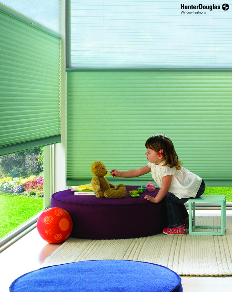
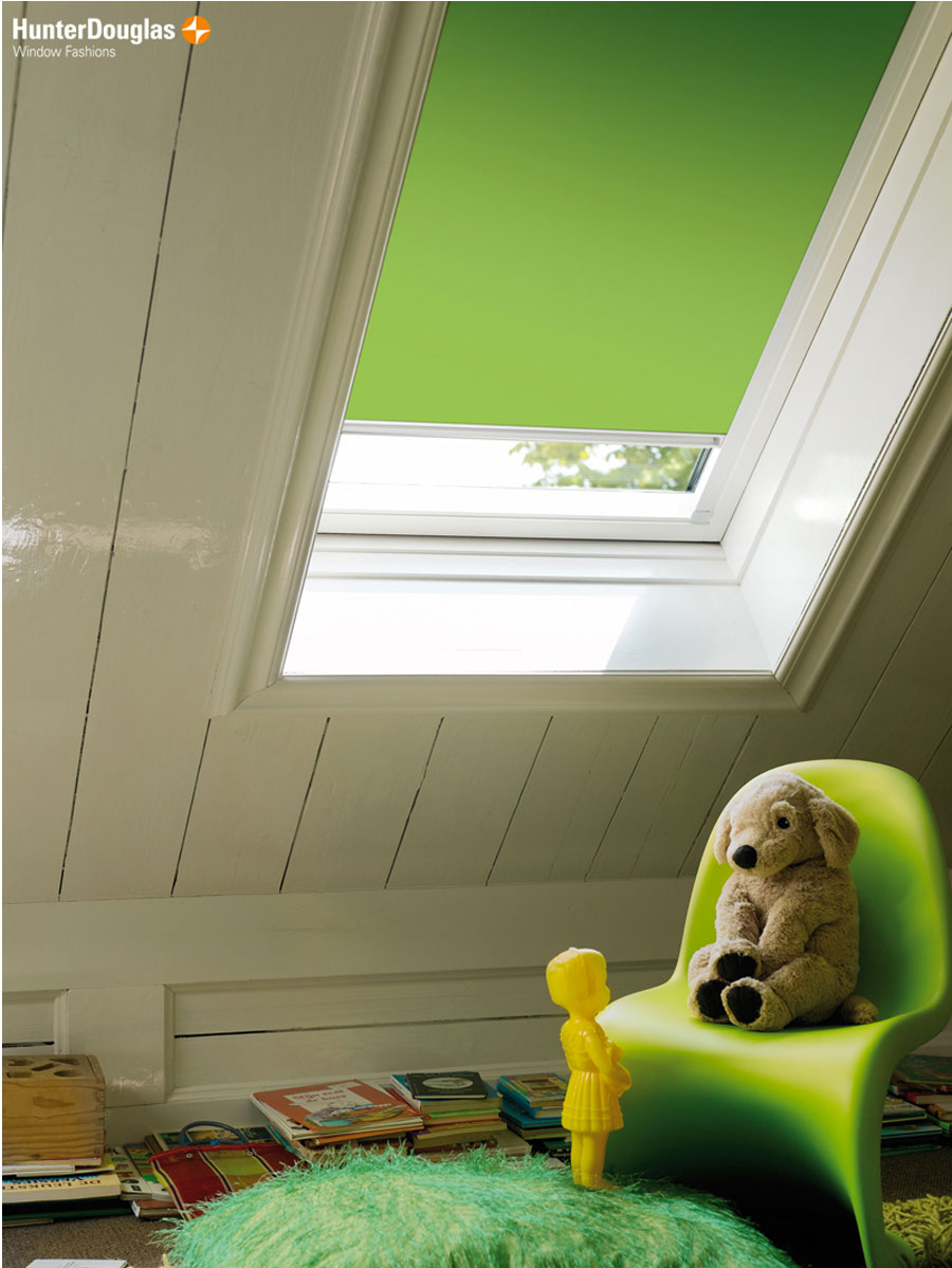
6. It is a neutral colour: If you are bored with the either blue-trains-theme or pink-ballerinas-theme nursery designs, opt for a scheme based on nature and animals that works for all kids of different genders and will last longer than the latest fad.
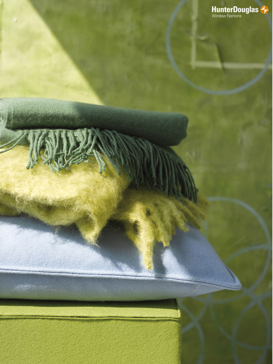
7. It is versatile: Used as blinds or shades or rug, greenery can change up an otherwise neutral scheme from dry to dramatic. Try it in sheers at the window, woolen-tufty rugs or as throws for a 2017 update you won’t have to commit to long term.
1. It loves texture: Explore the possibilities of using greenery in different textures for your furnishings. When combining with velvets or weaves, green can add some instant richness without being overpowering; a real grown up touch.
2. It can take change: Green in different shades work well together rather than fighting, so using it as a backdrop means you can use it to pull other items together coherently. Also, green is a neutral palette that blends with many other hues perfectly. For a soothing space, combine greens with earthy hues such as brown and beige; or add red and gold accessories to green background for an instant festive atmosphere.
3. It has unexpected qualities: With a yellow base tone, green hues can enhance the glowing effect of daylight and make a room look brighter and sunnier. Try the different transparencies in our Duette® window shades range for making the most of it.
4. It makes you feel good: Calming on the nervous system, green can turn a plain space into a relaxing one just by adding in some small accessories or a pot of greenery plant by the window.
5. It can be modern or traditional: Interestingly, green doesn’t feel attached to a design period, so you can use it anyway you want and the colour remains timeless.
6. It is a neutral colour: If you are bored with the either blue-trains-theme or pink-ballerinas-theme nursery designs, opt for a scheme based on nature and animals that works for all kids of different genders and will last longer than the latest fad.
7. It is versatile: Used as blinds or shades or rug, greenery can change up an otherwise neutral scheme from dry to dramatic. Try it in sheers at the window, woolen-tufty rugs or as throws for a 2017 update you won’t have to commit to long term.